


The CareMore Health identity is built on the idea of compassion in motion. The logo’s three heart-like shapes overlap to form a forward-moving icon, symbolizing care that is not only heartfelt but also active and progressive.
Each heart represents patients, providers, and community, coming together in partnership. Their collective movement creates momentum — a brand that doesn’t just care, but cares more, always pushing forward toward better health outcomes.
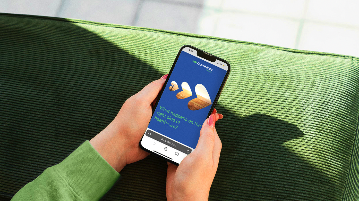
Beyond the logo, the full suite of branding assets was developed to extend this vision consistently across every touchpoint. A cohesive color palette, typography system, iconography, and visual language reinforce warmth, accessibility, and trust. Photography, graphic devices, and messaging were designed to work in harmony, ensuring the brand feels both human and forward-looking in print, digital, and environmental applications.